Optimising images for High DPI displays Published on: May 9, 2022
Over the last decade, we’ve gone from having a home PC to having a pocket PC that can access the internet everywhere. It came with plenty of freedom and new problems to solve. For example, we had to figure out how to present content on different screens.
This was answered through responsive design, meaning that we could rely on one codebase with adaptive layouts depending on the output device. Say you had a website with a large image for desktop computers that you wanted to display on mobile devices with smaller screens.
When you write HTML code you could use the srcset attribute on the image tag or a picture tag. Subsequently, the same image would be available in different sizes, and the browser would select the appropriate version.
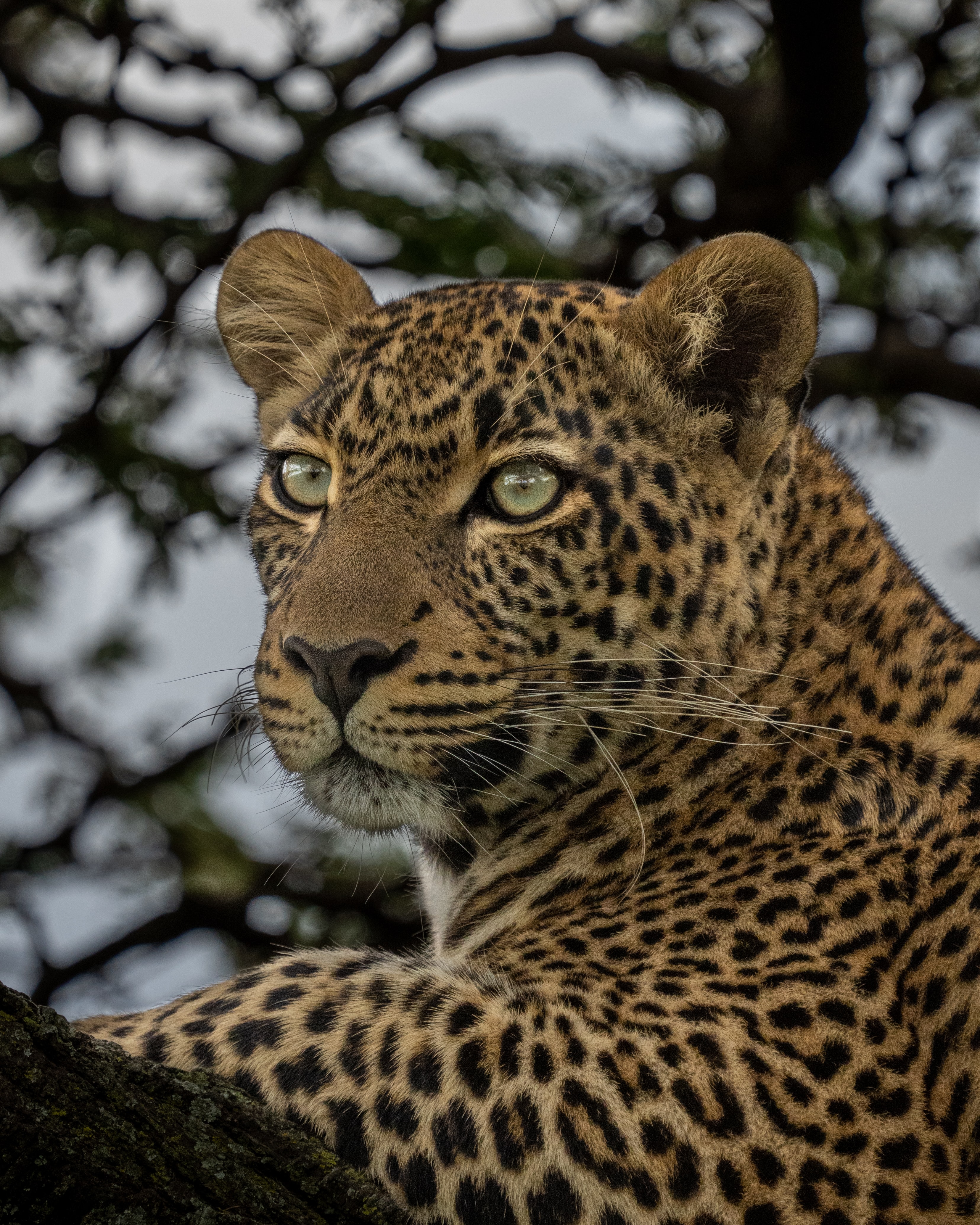
However, the problems don’t stop at adapting to different screen sizes. There’s another characteristic called DPI. Let’s discuss this concept in detail using this photo of a gorgeous cheetah to remind us how quickly we would like our images to load.

Photo by Ahmed Galal on Unsplash
What is DPI
DPI stands for “Dots Per Inch.” Initially, this term was mostly used to refer to an attribute of devices that put digital images onto paper and vice versa. These included scanners and printers. Therefore, DPI wasn’t a big concern for web content.
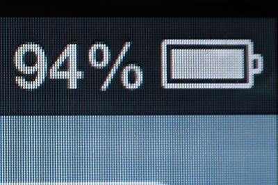
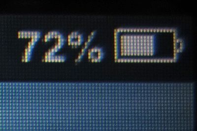
However, in 2010, Apple released the iPhone 4 with a Retina display. The main goal of that display was to make the output on the screen look closer to an actual photo and remove pixelation. The image below shows the clear difference between the Retina and non-retina display.
What was the significant change here?
Before the Retina display, you could refer to a device’s screen resolution to determine how wide your page or other content to be displayed should be. But with the advent of Retina display, the pixel now has two interpretations; hardware pixels and software pixels (CSS pixels).
Device manufacturers choose how many hardware pixels go into a CSS pixel, and this attribute is known as the device pixel ratio. For example, the Apple Retina display had a device pixel ratio of 2, meaning that one CSS pixel was equal to four hardware pixels (2 pixels in height and 2 in width).
The Galaxy S4 then took it up a notch with a device pixel ratio of 3, meaning one CSS pixel was equal to nine hardware pixels (3 in height and 3 in width). LG then dropped the G3 with a device pixel ratio of 4, which Samsung also adopted with the Galaxy S6.
We should remember that a CSS pixel is designed to result in the same size when the same content is being displayed on different devices with the same screen dimensions. Therefore, their differing device pixel ratios are responsible for the slight variations in the similarly sized content.
These variations manifest in the form of sharper text and icons, which you can easily notice at the edges of the characters and objects or any other part where contrasting colors border each other. The web browser will automatically render the content to output a suitable result in each case.
Support for DPI in HTML
There are two standard ways of accommodating your HTML markup for high DPI screens when using a tag with the
srcset attribute.
The first option is to use the DPI (x) descriptor when specifying the URL:
<img srcset="
        cheetah.jpg,
        cheetah-2x.jpg 2x,
        cheetah-3x.jpg 3x,
    "
     src="cheetah.jpg"
     alt="Cheetah"/>
In the example above, the image will have the same screen size on all devices, and a browser will pick the one that matches the user’s screen DPI. But what if we need an image to have different sizes on different screens? Say you want to have full width on mobile and 400px on the desktop.
In that case, we would need to go with the width descriptor in the srcset attribute:
<img srcset="
        cheetah-400w.jpg 400w,
        cheetah-500w.jpg 500w,
        cheetah-600w.jpg 600w,
        cheetah-800w.jpg 800w,
        cheetah-1000w.jpg 1000w,
        cheetah-1200w.jpg 1200w,
        cheetah-1500w.jpg 1500w,
        cheetah-1800w.jpg 1800w,
    "
     src="cheetah.jpg"
     sizes="
        (max-width: 768px) 100vw,
        400px
     "
     alt="Cheetah"
/>
Notice how many sizes we included? That’s because mobile devices are different in size and also in DPI. So for a 400px-wide screen, we would need to have three images; 400px, 800px and 1200px. A browser will work its magic to pick the appropriate image based on the visible image size, display characteristics and other factors.
By the way, picking the sizes for srcset can be quite tricky. On the one hand, you could look up devices or screen sizes using analytics tools and target them directly. You may find sizes like 390px wide for the iPhone 12, 393px for the Pixel 5 and 375px for the iPhone SE, among others.
However, this approach comes with some drawbacks. Firstly, you’d need to update sizes whenever a new device is released and becomes popular, which can be quite the hassle. Secondly, having too many variants could decrease your CDN cache hit ratio, meaning you won’t be leveraging the full power of network edges.
So rather than going with specific devices, we recommend sticking with ranges like 400, 500 and 600 pixels. If we open the Chrome web browser with the Developer console and select Samsung or iPhone 12 Pro, we will see that the browser will load the 1200 pixels version because the screen DPI is 3.
If we change the device to iPhone SE, the browser will opt for the 800 pixels version. On that note, let’s have a look at the sizes of the images loaded for 1, 2 and 3 DPI:
- cheetah-400w.jpg - 42 Kb
- cheetah-800w.jpg - 141 Kb
- cheetah-1200w.jpg - 298 Kb
Therefore, upon loading an image on a higher DPI display, the size of the image will also increase. This becomes a bigger concern when we understand that high DPI displays are often mobile devices on networks that might not always be as good as home broadband. So how can we make images load faster in such cases?
Delivering smaller images for High DPI screens
When discussing images, their sizes and the bandwidth used, it is crucial to understand what happens when you display the bigger image (1200px) on a smaller physical screen (400 screen pixels). The quality improves, as seen in the example from the intro.
However, there’s only so much detail the human eye can see when it comes to photos. Consequently, we can use more aggressive compression for displays with higher DPIs. So let’s encode our 3x variant with lower quality.
The 3x version is 154Kb, which is still greater than the 1x, but two times smaller than the original version. So, now that we know what we’d like to achieve, here’s how to proceed:
Load the larger version of the image on high DPI displays, but use lower quality. Unfortunately, this isn’t possible to implement with the tag at the moment. This is because we can’t mix w and x descriptors; otherwise, we’d do something like https://website.com/images/logo-800w-2x.png, with 800w and 2x in the srcset attribute to tell the browser what image to load.
Instead, we can use the <picture> tag with media selectors. Fortunately, there’s
a resolution CSS media selector that we can use in
this manner. But it may not be that easy, seeing as browsers like Safari still don’t support it. Nevertheless, there’s a
similar solution known as
the –webkit-device-pixel-ratio selector
that is supported everywhere.
Accordingly, let’s take a look at how to combine it with the srcset attribute:
<picture>
  <source
      media="(-webkit-min-device-pixel-ratio: 2) and (-webkit-max-device-pixel-ratio: 2.9999)"
      srcset="
            q50/cheetah-400w.jpg 400w,
            q50/cheetah-500w.jpg 500w,
            q50/cheetah-600w.jpg 600w,
            q50/cheetah-800w.jpg 800w,
            q50/cheetah-1000w.jpg 1000w,
            q50/cheetah-1200w.jpg 1200w,
            q50/cheetah-1500w.jpg 1500w,
            q50/cheetah-1800w.jpg 1800w
          "
      sizes="(max-width: 768px) 100vw, 400px"
  >
  <source
      media="(-webkit-min-device-pixel-ratio: 3)"
      srcset="
            q40/cheetah-400w.jpg 400w,
            q40/cheetah-500w.jpg 500w,
            q40/cheetah-600w.jpg 600w,
            q40/cheetah-800w.jpg 800w,
            q40/cheetah-1000w.jpg 1000w,
            q40/cheetah-1200w.jpg 1200w,
            q40/cheetah-1500w.jpg 1500w,
            q40/cheetah-1800w.jpg 1800w
          "
      sizes="(max-width: 768px) 100vw, 400px"
  >
  <img
      src="cheetah.jpg"
      srcset="
            cheetah-400w.jpg 400w,
            cheetah-500w.jpg 500w,
            cheetah-600w.jpg 600w,
            cheetah-800w.jpg 800w,
            cheetah-1000w.jpg 1000w,
            cheetah-1200w.jpg 1200w,
            cheetah-1500w.jpg 1500w,
            cheetah-1800w.jpg 1800w
          "
      alt="Cheetah"
      sizes="(max-width: 768px) 100vw, 400px"
  >
</picture>
Now that looks better as we load lower quality images for screens with a DPI of 2 or 3, and even lower quality from 3 onwards. Nonetheless, I wouldn’t recommend this example in the production because it’s not leveraging next-generation formats like WebP and AVIF.
Now, that looks better, as we load lower quality image for screens with DPI 2 to 3 and even lower quality from 3 onwards
To add next-gen formats into the mix, we need to use the type attribute of the tag and add a separate source for every format. It’s important to remember that the browser will use the first source it can load, so we should start with AVIF, then go to WebP, and lastly, JPEG.
<picture>
  <source
      media="(-webkit-min-device-pixel-ratio: 2) and (-webkit-max-device-pixel-ratio: 2.9999)"
      type="image/avif"
      srcset="
            q50-avif/cheetah-400w.avif 400w,
            q50-avif/cheetah-500w.avif 500w,
            q50-avif/cheetah-600w.avif 600w,
            q50-avif/cheetah-800w.avif 800w,
            q50-avif/cheetah-1000w.avif 1000w,
            q50-avif/cheetah-1200w.avif 1200w,
            q50-avif/cheetah-1500w.avif 1500w,
            q50-avif/cheetah-1800w.avif 1800w
          "
      sizes="(max-width: 768px) 100vw, 400px"
  >
  <source
      media="(-webkit-min-device-pixel-ratio: 2) and (-webkit-max-device-pixel-ratio: 2.9999)"
      type="image/webp"
      srcset="
            q50-webp/cheetah-400w.webp 400w,
            q50-webp/cheetah-500w.webp 500w,
            q50-webp/cheetah-600w.webp 600w,
            q50-webp/cheetah-800w.webp 800w,
            q50-webp/cheetah-1000w.webp 1000w,
            q50-webp/cheetah-1200w.webp 1200w,
            q50-webp/cheetah-1500w.webp 1500w,
            q50-webp/cheetah-1800w.webp 1800w
          "
      sizes="(max-width: 768px) 100vw, 400px"
  >
  <source
      media="(-webkit-min-device-pixel-ratio: 2) and (-webkit-max-device-pixel-ratio: 2.9999)"
      srcset="
            q50/cheetah-400w.jpg 400w,
            q50/cheetah-500w.jpg 500w,
            q50/cheetah-600w.jpg 600w,
            q50/cheetah-800w.jpg 800w,
            q50/cheetah-1000w.jpg 1000w,
            q50/cheetah-1200w.jpg 1200w,
            q50/cheetah-1500w.jpg 1500w,
            q50/cheetah-1800w.jpg 1800w
          "
      sizes="(max-width: 768px) 100vw, 400px"
  >
  <source
      media="(-webkit-min-device-pixel-ratio: 3)"
      type="image/avif"
      srcset="
            q40-avif/cheetah-400w.avif 400w,
            q40-avif/cheetah-500w.avif 500w,
            q40-avif/cheetah-600w.avif 600w,
            q40-avif/cheetah-800w.avif 800w,
            q40-avif/cheetah-1000w.avif 1000w,
            q40-avif/cheetah-1200w.avif 1200w,
            q40-avif/cheetah-1500w.avif 1500w,
            q40-avif/cheetah-1800w.avif 1800w
          "
      sizes="(max-width: 768px) 100vw, 400px"
  >
  <source
      media="(-webkit-min-device-pixel-ratio: 3)"
      type="image/webp"
      srcset="
            q40-webp/cheetah-400w.webp 400w,
            q40-webp/cheetah-500w.webp 500w,
            q40-webp/cheetah-600w.webp 600w,
            q40-webp/cheetah-800w.webp 800w,
            q40-webp/cheetah-1000w.webp 1000w,
            q40-webp/cheetah-1200w.webp 1200w,
            q40-webp/cheetah-1500w.webp 1500w,
            q40-webp/cheetah-1800w.webp 1800w
          "
      sizes="(max-width: 768px) 100vw, 400px"
  >
  <source
      media="(-webkit-min-device-pixel-ratio: 3)"
      srcset="
            q40/cheetah-400w.jpg 400w,
            q40/cheetah-500w.jpg 500w,
            q40/cheetah-600w.jpg 600w,
            q40/cheetah-800w.jpg 800w,
            q40/cheetah-1000w.jpg 1000w,
            q40/cheetah-1200w.jpg 1200w,
            q40/cheetah-1500w.jpg 1500w,
            q40/cheetah-1800w.jpg 1800w
          "
      sizes="(max-width: 768px) 100vw, 400px"
  >
  <img
      src="cheetah.jpg"
      srcset="
            cheetah-400w.jpg 400w,
            cheetah-500w.jpg 500w,
            cheetah-600w.jpg 600w,
            cheetah-800w.jpg 800w,
            cheetah-1000w.jpg 1000w,
            cheetah-1200w.jpg 1500w,
            cheetah-1200w.jpg 1800w
          "
      alt="Cheetah"
      sizes="(max-width: 768px) 100vw, 400px"
  >
</picture>
And here it is! The snippet that will give us the best mix of quality and performance. It’s also worth mentioning that there’s no javascript involved. The downside is that we would need to prepare 48 variants of the source image. This is where an Image CDN can help.
Using an Image CDN to reduce the number of source images
With Pixboost as an example, let’s see how to produce all the required variants using an Image Processing API. Firstly, you’ll need to create a free account at Pixboost.com. Then, when you log in for the first time, add a new image source as in the video below.
Now, you can use the /resize API to produce all the needed sizes and next-generation formats.
<img srcset="
        https://pixboost.com/api/2/img/http://www.midday.coffee/dppx-demo/cheetah.jpg/resize?size=400&auth=MTA0ODU5NDA0NQ__ 400w,
        https://pixboost.com/api/2/img/http://www.midday.coffee/dppx-demo/cheetah.jpg/resize?size=500&auth=MTA0ODU5NDA0NQ__ 500w,
        https://pixboost.com/api/2/img/http://www.midday.coffee/dppx-demo/cheetah.jpg/resize?size=600&auth=MTA0ODU5NDA0NQ__ 600w,
        https://pixboost.com/api/2/img/http://www.midday.coffee/dppx-demo/cheetah.jpg/resize?size=800&auth=MTA0ODU5NDA0NQ__ 800w,
        https://pixboost.com/api/2/img/http://www.midday.coffee/dppx-demo/cheetah.jpg/resize?size=1000&auth=MTA0ODU5NDA0NQ__ 1000w,
        https://pixboost.com/api/2/img/http://www.midday.coffee/dppx-demo/cheetah.jpg/resize?size=1200&auth=MTA0ODU5NDA0NQ__ 1200w,
        https://pixboost.com/api/2/img/http://www.midday.coffee/dppx-demo/cheetah.jpg/resize?size=1500&auth=MTA0ODU5NDA0NQ__ 1500w,
        https://pixboost.com/api/2/img/http://www.midday.coffee/dppx-demo/cheetah.jpg/resize?size=1800&auth=MTA0ODU5NDA0NQ__ 1800w
    "
     src="cheetah.jpg"
     sizes="
        (max-width: 768px) 100vw,
        400px
    "
     alt="Cheetah"
/>
The above code will cater to different sizes and next-generation formats by using the Accept header. A browser will send a list of supported formats to the API, and Pixboost will choose the best one to use. The only missing part now is the additional compression on screens with DPI >= 2. Finally, we have our new API feature; the ?dppx query parameter.
API support for High DPI screens
The new ?dppx hint passes the screen DPI to the API, so we can perform optimizations based on its value.
Having a ?ddpx and not a direct quality gives us plenty of room to add more enhancements. We believe the end-user
doesn’t need direct access to those configurations, which would become harder to support in the long run. The most
recent example is the AVIF format that was introduced last year. It enables us to use much higher compression while
keeping the same level of visual perception. We can also use different quality and types of compression for various
kinds of images such as photos, illustrations and more.
To introduce ?dppx support into our HTML code, we still need to use the <picture> tag with media queries. But just
like with the <img> example, we don’t need to specify a separate <source> for the next-generation formats.
<picture>
  <source
      media="(-webkit-min-device-pixel-ratio: 2) and (-webkit-max-device-pixel-ratio: 2.9999)"
      srcset="
        https://pixboost.com/api/2/img/http://www.midday.coffee/dppx-demo/cheetah.jpg/resize?size=400&dppx=2&auth=MTA0ODU5NDA0NQ__ 400w,
        https://pixboost.com/api/2/img/http://www.midday.coffee/dppx-demo/cheetah.jpg/resize?size=500&dppx=2&auth=MTA0ODU5NDA0NQ__ 500w,
        https://pixboost.com/api/2/img/http://www.midday.coffee/dppx-demo/cheetah.jpg/resize?size=600&dppx=2&auth=MTA0ODU5NDA0NQ__ 600w,
        https://pixboost.com/api/2/img/http://www.midday.coffee/dppx-demo/cheetah.jpg/resize?size=800&dppx=2&auth=MTA0ODU5NDA0NQ__ 800w,
        https://pixboost.com/api/2/img/http://www.midday.coffee/dppx-demo/cheetah.jpg/resize?size=1000&dppx=2&auth=MTA0ODU5NDA0NQ__ 1000w,
        https://pixboost.com/api/2/img/http://www.midday.coffee/dppx-demo/cheetah.jpg/resize?size=1200&dppx=2&auth=MTA0ODU5NDA0NQ__ 1200w,
        https://pixboost.com/api/2/img/http://www.midday.coffee/dppx-demo/cheetah.jpg/resize?size=1500&dppx=2&auth=MTA0ODU5NDA0NQ__ 1500w,
        https://pixboost.com/api/2/img/http://www.midday.coffee/dppx-demo/cheetah.jpg/resize?size=1800&dppx=2&auth=MTA0ODU5NDA0NQ__ 1800w
      "
      sizes="(max-width: 768px) 100vw, 400px"
  >
  <source
      media="(-webkit-min-device-pixel-ratio: 3)"
      srcset="
        https://pixboost.com/api/2/img/http://www.midday.coffee/dppx-demo/cheetah.jpg/resize?size=400&dppx=3&auth=MTA0ODU5NDA0NQ__ 400w,
        https://pixboost.com/api/2/img/http://www.midday.coffee/dppx-demo/cheetah.jpg/resize?size=500&dppx=3&auth=MTA0ODU5NDA0NQ__ 500w,
        https://pixboost.com/api/2/img/http://www.midday.coffee/dppx-demo/cheetah.jpg/resize?size=600&dppx=3&auth=MTA0ODU5NDA0NQ__ 600w,
        https://pixboost.com/api/2/img/http://www.midday.coffee/dppx-demo/cheetah.jpg/resize?size=800&dppx=3&auth=MTA0ODU5NDA0NQ__ 800w,
        https://pixboost.com/api/2/img/http://www.midday.coffee/dppx-demo/cheetah.jpg/resize?size=1000&dppx=3&auth=MTA0ODU5NDA0NQ__ 1000w,
        https://pixboost.com/api/2/img/http://www.midday.coffee/dppx-demo/cheetah.jpg/resize?size=1200&dppx=3&auth=MTA0ODU5NDA0NQ__ 1200w,
        https://pixboost.com/api/2/img/http://www.midday.coffee/dppx-demo/cheetah.jpg/resize?size=1500&dppx=3&auth=MTA0ODU5NDA0NQ__ 1500w,
        https://pixboost.com/api/2/img/http://www.midday.coffee/dppx-demo/cheetah.jpg/resize?size=1800&dppx=3&auth=MTA0ODU5NDA0NQ__ 1800w
      "
      sizes="(max-width: 768px) 100vw, 400px"
  >
  <img
      src="cheetah.jpg"
      srcset="
        https://pixboost.com/api/2/img/http://www.midday.coffee/dppx-demo/cheetah.jpg/resize?size=400&auth=MTA0ODU5NDA0NQ__ 400w,
        https://pixboost.com/api/2/img/http://www.midday.coffee/dppx-demo/cheetah.jpg/resize?size=500&auth=MTA0ODU5NDA0NQ__ 500w,
        https://pixboost.com/api/2/img/http://www.midday.coffee/dppx-demo/cheetah.jpg/resize?size=600&auth=MTA0ODU5NDA0NQ__ 600w,
        https://pixboost.com/api/2/img/http://www.midday.coffee/dppx-demo/cheetah.jpg/resize?size=800&auth=MTA0ODU5NDA0NQ__ 800w,
        https://pixboost.com/api/2/img/http://www.midday.coffee/dppx-demo/cheetah.jpg/resize?size=1000&auth=MTA0ODU5NDA0NQ__ 1000w,
        https://pixboost.com/api/2/img/http://www.midday.coffee/dppx-demo/cheetah.jpg/resize?size=1200&auth=MTA0ODU5NDA0NQ__ 1200w,
        https://pixboost.com/api/2/img/http://www.midday.coffee/dppx-demo/cheetah.jpg/resize?size=1500&auth=MTA0ODU5NDA0NQ__ 1500w,
        https://pixboost.com/api/2/img/http://www.midday.coffee/dppx-demo/cheetah.jpg/resize?size=1800&auth=MTA0ODU5NDA0NQ__ 1800w
      "
      alt="Cheetah"
      sizes="(max-width: 768px) 100vw, 400px"
  >
</picture>
And now, we have the perfect snippet for showing responsive images on the website.
Obsolete methods
Some time ago, there was an approach that relied on the screen DPR client hint to pick an image source, and the Content-DPR header would confirm the image device pixel ratio in such requests.
Where the Content-DPR value differs from the DPR value (the screen DPR isn’t the same as the image DPR), the Content-DPR would be used to ascertain the inherent image size and scale the image accordingly.
This approach used the most recent instance of the Content-DPR if the Content-DPR header appeared more than once in a message. But over time, there was a lack of consensus around Content-DPR, with many not seeing image resolution as a transport-level feature.
Therefore, the new approach was to specify the intrinsic resolution within the EXIF metadata. As we speak, Content-DPR is no longer supported by many browsers, while others are in the process of dropping it, and a few have only kept it for backward-compatibility reasons.
Conclusion
The web changed a lot once we were able to use our phones, tablets, fridges and other devices to access the internet. To deliver images with higher visual fidelity, we need to support screens with DPI > 2. However, for the internet to be more accessible, we need to cater to people without fast connections by sending them only the data they need.
We can achieve this goal by using higher compression on High DPI screens. Additionally, using an Image CDN comes with some practical long-term benefits such as:
- Making your processes more lightweight when storing only one source image
- Cleaning up your markup by removing the need for a separate source for the next-gen formats
- Future-proofing your image delivery with automatic support for new formats and features (it is vital to note that switching to formats like AVIF can enable you up to 80% more compression than JPEG offers without losing quality, which bodes well for your website’s performance)
- Content-sensitive compression - an Image CDN can automatically change the compression quality for each image based on what’s in the image. For example, images with fewer colors and less detail will be compressed a lot more than those that are rich in detail, color and other patterns. By doing so, you can strike the perfect middle-ground between quality and size for each image.
If you would like to discover the shortfalls in your web project’s image optimization and the extent to which they diminish overall website speed, you can use Google PageSpeed insights and zoom in on PageDetox.
Credits
The method and API design is base on the article written by the web performance god - Jake Archibald.
Examples
These are the examples with code snippets we used through the article. Every image shows the source it loaded under it, so you can change a device in the Chrome Developer Tools emulator and see how source of the image changes when you update it.
Using DPI descriptor
<img srcset="
    cheetah.jpg,
    cheetah-2x.jpg 2x,
    cheetah-3x.jpg 3x,
"
     src="cheetah.jpg"
     alt="Cheetah"/>
Source:
Using width descriptors
<img srcset="
        cheetah-400w.jpg 400w,
        cheetah-500w.jpg 500w,
        cheetah-600w.jpg 600w,
        cheetah-800w.jpg 800w,
        cheetah-1000w.jpg 1000w,
        cheetah-1200w.jpg 1200w,
        cheetah-1500w.jpg 1500w,
        cheetah-1800w.jpg 1800w,
    "
     src="cheetah.jpg"
     sizes="
        (max-width: 768px) 100vw,
        400px
    "
     alt="Cheetah"
/>
Source:
Picture tag
<picture>
  <source
      media="(-webkit-min-device-pixel-ratio: 2) and (-webkit-max-device-pixel-ratio: 2.9999)"
      srcset="
            q50/cheetah-400w.jpg 400w,
            q50/cheetah-500w.jpg 500w,
            q50/cheetah-600w.jpg 600w,
            q50/cheetah-800w.jpg 800w,
            q50/cheetah-1000w.jpg 1000w,
            q50/cheetah-1200w.jpg 1200w,
            q50/cheetah-1500w.jpg 1500w,
            q50/cheetah-1800w.jpg 1800w
          "
      sizes="(max-width: 768px) 100vw, 400px"
  >
  <source
      media="(-webkit-min-device-pixel-ratio: 3)"
      srcset="
            q40/cheetah-400w.jpg 400w,
            q40/cheetah-500w.jpg 500w,
            q40/cheetah-600w.jpg 600w,
            q40/cheetah-800w.jpg 800w,
            q40/cheetah-1000w.jpg 1000w,
            q40/cheetah-1200w.jpg 1200w,
            q40/cheetah-1500w.jpg 1500w,
            q40/cheetah-1800w.jpg 1800w
          "
      sizes="(max-width: 768px) 100vw, 400px"
  >
  <img
      src="cheetah.jpg"
      srcset="
            cheetah-400w.jpg 400w,
            cheetah-500w.jpg 500w,
            cheetah-600w.jpg 600w,
            cheetah-800w.jpg 800w,
            cheetah-1000w.jpg 1000w,
            cheetah-1200w.jpg 1200w,
            cheetah-1500w.jpg 1500w,
            cheetah-1800w.jpg 1800w
          "
      alt="Cheetah"
      sizes="(max-width: 768px) 100vw, 400px"
  >
</picture>
Source:
Picture with next-gen formats
<picture>
  <source
      media="(-webkit-min-device-pixel-ratio: 2) and (-webkit-max-device-pixel-ratio: 2.9999)"
      type="image/avif"
      srcset="
            q50-avif/cheetah-400w.avif 400w,
            q50-avif/cheetah-500w.avif 500w,
            q50-avif/cheetah-600w.avif 600w,
            q50-avif/cheetah-800w.avif 800w,
            q50-avif/cheetah-1000w.avif 1000w,
            q50-avif/cheetah-1200w.avif 1200w,
            q50-avif/cheetah-1500w.avif 1500w,
            q50-avif/cheetah-1800w.avif 1800w
          "
      sizes="(max-width: 768px) 100vw, 400px"
  >
  <source
      media="(-webkit-min-device-pixel-ratio: 2) and (-webkit-max-device-pixel-ratio: 2.9999)"
      type="image/webp"
      srcset="
            q50-webp/cheetah-400w.webp 400w,
            q50-webp/cheetah-500w.webp 500w,
            q50-webp/cheetah-600w.webp 600w,
            q50-webp/cheetah-800w.webp 800w,
            q50-webp/cheetah-1000w.webp 1000w,
            q50-webp/cheetah-1200w.webp 1200w,
            q50-webp/cheetah-1500w.webp 1500w,
            q50-webp/cheetah-1800w.webp 1800w
          "
      sizes="(max-width: 768px) 100vw, 400px"
  >
  <source
      media="(-webkit-min-device-pixel-ratio: 2) and (-webkit-max-device-pixel-ratio: 2.9999)"
      srcset="
            q50/cheetah-400w.jpg 400w,
            q50/cheetah-500w.jpg 500w,
            q50/cheetah-600w.jpg 600w,
            q50/cheetah-800w.jpg 800w,
            q50/cheetah-1000w.jpg 1000w,
            q50/cheetah-1200w.jpg 1200w,
            q50/cheetah-1500w.jpg 1500w,
            q50/cheetah-1800w.jpg 1800w
          "
      sizes="(max-width: 768px) 100vw, 400px"
  >
  <source
      media="(-webkit-min-device-pixel-ratio: 3)"
      type="image/avif"
      srcset="
            q40-avif/cheetah-400w.avif 400w,
            q40-avif/cheetah-500w.avif 500w,
            q40-avif/cheetah-600w.avif 600w,
            q40-avif/cheetah-800w.avif 800w,
            q40-avif/cheetah-1000w.avif 1000w,
            q40-avif/cheetah-1200w.avif 1200w,
            q40-avif/cheetah-1500w.avif 1500w,
            q40-avif/cheetah-1800w.avif 1800w
          "
      sizes="(max-width: 768px) 100vw, 400px"
  >
  <source
      media="(-webkit-min-device-pixel-ratio: 3)"
      type="image/webp"
      srcset="
            q40-webp/cheetah-400w.webp 400w,
            q40-webp/cheetah-500w.webp 500w,
            q40-webp/cheetah-600w.webp 600w,
            q40-webp/cheetah-800w.webp 800w,
            q40-webp/cheetah-1000w.webp 1000w,
            q40-webp/cheetah-1200w.webp 1200w,
            q40-webp/cheetah-1500w.webp 1500w,
            q40-webp/cheetah-1800w.webp 1800w
          "
      sizes="(max-width: 768px) 100vw, 400px"
  >
  <source
      media="(-webkit-min-device-pixel-ratio: 3)"
      srcset="
            q40/cheetah-400w.jpg 400w,
            q40/cheetah-500w.jpg 500w,
            q40/cheetah-600w.jpg 600w,
            q40/cheetah-800w.jpg 800w,
            q40/cheetah-1000w.jpg 1000w,
            q40/cheetah-1200w.jpg 1200w,
            q40/cheetah-1500w.jpg 1500w,
            q40/cheetah-1800w.jpg 1800w
          "
      sizes="(max-width: 768px) 100vw, 400px"
  >
  <img
      src="cheetah.jpg"
      srcset="
            cheetah-400w.jpg 400w,
            cheetah-500w.jpg 500w,
            cheetah-600w.jpg 600w,
            cheetah-800w.jpg 800w,
            cheetah-1000w.jpg 1000w,
            cheetah-1200w.jpg 1500w,
            cheetah-1200w.jpg 1800w
          "
      alt="Cheetah"
      sizes="(max-width: 768px) 100vw, 400px"
  >
</picture>
Source:
Responsive <img> using pixboost
<img srcset="
        https://pixboost.com/api/2/img/http://www.midday.coffee/dppx-demo/cheetah.jpg/resize?size=400&auth=MTA0ODU5NDA0NQ__ 400w,
        https://pixboost.com/api/2/img/http://www.midday.coffee/dppx-demo/cheetah.jpg/resize?size=500&auth=MTA0ODU5NDA0NQ__ 500w,
        https://pixboost.com/api/2/img/http://www.midday.coffee/dppx-demo/cheetah.jpg/resize?size=600&auth=MTA0ODU5NDA0NQ__ 600w,
        https://pixboost.com/api/2/img/http://www.midday.coffee/dppx-demo/cheetah.jpg/resize?size=800&auth=MTA0ODU5NDA0NQ__ 800w,
        https://pixboost.com/api/2/img/http://www.midday.coffee/dppx-demo/cheetah.jpg/resize?size=1000&auth=MTA0ODU5NDA0NQ__ 1000w,
        https://pixboost.com/api/2/img/http://www.midday.coffee/dppx-demo/cheetah.jpg/resize?size=1200&auth=MTA0ODU5NDA0NQ__ 1200w,
        https://pixboost.com/api/2/img/http://www.midday.coffee/dppx-demo/cheetah.jpg/resize?size=1500&auth=MTA0ODU5NDA0NQ__ 1500w,
        https://pixboost.com/api/2/img/http://www.midday.coffee/dppx-demo/cheetah.jpg/resize?size=1800&auth=MTA0ODU5NDA0NQ__ 1800w
    "
     src="cheetah.jpg"
     sizes="
        (max-width: 768px) 100vw,
        400px
    "
     alt="Cheetah"
/>
Source:
Responsive image with DPI support using Pixboost
<picture>
  <source
      media="(-webkit-min-device-pixel-ratio: 2) and (-webkit-max-device-pixel-ratio: 2.9999)"
      srcset="
        https://pixboost.com/api/2/img/http://www.midday.coffee/dppx-demo/cheetah.jpg/resize?size=400&dppx=2&auth=MTA0ODU5NDA0NQ__ 400w,
        https://pixboost.com/api/2/img/http://www.midday.coffee/dppx-demo/cheetah.jpg/resize?size=500&dppx=2&auth=MTA0ODU5NDA0NQ__ 500w,
        https://pixboost.com/api/2/img/http://www.midday.coffee/dppx-demo/cheetah.jpg/resize?size=600&dppx=2&auth=MTA0ODU5NDA0NQ__ 600w,
        https://pixboost.com/api/2/img/http://www.midday.coffee/dppx-demo/cheetah.jpg/resize?size=800&dppx=2&auth=MTA0ODU5NDA0NQ__ 800w,
        https://pixboost.com/api/2/img/http://www.midday.coffee/dppx-demo/cheetah.jpg/resize?size=1000&dppx=2&auth=MTA0ODU5NDA0NQ__ 1000w,
        https://pixboost.com/api/2/img/http://www.midday.coffee/dppx-demo/cheetah.jpg/resize?size=1200&dppx=2&auth=MTA0ODU5NDA0NQ__ 1200w,
        https://pixboost.com/api/2/img/http://www.midday.coffee/dppx-demo/cheetah.jpg/resize?size=1500&dppx=2&auth=MTA0ODU5NDA0NQ__ 1500w,
        https://pixboost.com/api/2/img/http://www.midday.coffee/dppx-demo/cheetah.jpg/resize?size=1800&dppx=2&auth=MTA0ODU5NDA0NQ__ 1800w
      "
      sizes="(max-width: 768px) 100vw, 400px"
  >
  <source
      media="(-webkit-min-device-pixel-ratio: 3)"
      srcset="
        https://pixboost.com/api/2/img/http://www.midday.coffee/dppx-demo/cheetah.jpg/resize?size=400&dppx=3&auth=MTA0ODU5NDA0NQ__ 400w,
        https://pixboost.com/api/2/img/http://www.midday.coffee/dppx-demo/cheetah.jpg/resize?size=500&dppx=3&auth=MTA0ODU5NDA0NQ__ 500w,
        https://pixboost.com/api/2/img/http://www.midday.coffee/dppx-demo/cheetah.jpg/resize?size=600&dppx=3&auth=MTA0ODU5NDA0NQ__ 600w,
        https://pixboost.com/api/2/img/http://www.midday.coffee/dppx-demo/cheetah.jpg/resize?size=800&dppx=3&auth=MTA0ODU5NDA0NQ__ 800w,
        https://pixboost.com/api/2/img/http://www.midday.coffee/dppx-demo/cheetah.jpg/resize?size=1000&dppx=3&auth=MTA0ODU5NDA0NQ__ 1000w,
        https://pixboost.com/api/2/img/http://www.midday.coffee/dppx-demo/cheetah.jpg/resize?size=1200&dppx=3&auth=MTA0ODU5NDA0NQ__ 1200w,
        https://pixboost.com/api/2/img/http://www.midday.coffee/dppx-demo/cheetah.jpg/resize?size=1500&dppx=3&auth=MTA0ODU5NDA0NQ__ 1500w,
        https://pixboost.com/api/2/img/http://www.midday.coffee/dppx-demo/cheetah.jpg/resize?size=1800&dppx=3&auth=MTA0ODU5NDA0NQ__ 1800w
      "
      sizes="(max-width: 768px) 100vw, 400px"
  >
  <img
      src="cheetah.jpg"
      srcset="
        https://pixboost.com/api/2/img/http://www.midday.coffee/dppx-demo/cheetah.jpg/resize?size=400&auth=MTA0ODU5NDA0NQ__ 400w,
        https://pixboost.com/api/2/img/http://www.midday.coffee/dppx-demo/cheetah.jpg/resize?size=500&auth=MTA0ODU5NDA0NQ__ 500w,
        https://pixboost.com/api/2/img/http://www.midday.coffee/dppx-demo/cheetah.jpg/resize?size=600&auth=MTA0ODU5NDA0NQ__ 600w,
        https://pixboost.com/api/2/img/http://www.midday.coffee/dppx-demo/cheetah.jpg/resize?size=800&auth=MTA0ODU5NDA0NQ__ 800w,
        https://pixboost.com/api/2/img/http://www.midday.coffee/dppx-demo/cheetah.jpg/resize?size=1000&auth=MTA0ODU5NDA0NQ__ 1000w,
        https://pixboost.com/api/2/img/http://www.midday.coffee/dppx-demo/cheetah.jpg/resize?size=1200&auth=MTA0ODU5NDA0NQ__ 1200w,
        https://pixboost.com/api/2/img/http://www.midday.coffee/dppx-demo/cheetah.jpg/resize?size=1500&auth=MTA0ODU5NDA0NQ__ 1500w,
        https://pixboost.com/api/2/img/http://www.midday.coffee/dppx-demo/cheetah.jpg/resize?size=1800&auth=MTA0ODU5NDA0NQ__ 1800w
      "
      alt="Cheetah"
      sizes="(max-width: 768px) 100vw, 400px"
  >
</picture>
Source: